Geometry Management
11.1 Placing the widgets
As indicated before widgets only become visible when they are placed within their parent window via a geometry manager. Tk has three different geometry managers: grid, pack and place.
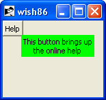
The simplest of these is place. It is also the least used, as you are yourself responsible for determining the coordinates of your widget. But in rare cases it is useful, for instance if you want to create a “tooltip” — a window with explanatory text that appears and disappears near a pushbutton or another widget. Here is an example, with the result shown in Figure 2:
    button .help -text Help
    bind .help <Enter> {showHelpTip %x %y}
    bind .help <Leave> {removeHelpTip}

    proc showHelpTip {xcoord ycoord} {
        #
        # Show the tooltip after half a second
        #
        set ::after [after 500 [list displayHelpTip $xcoord $ycoord]]
    }
    proc removeHelpTip {} {
        if { [winfo exists .helpTip] } {
            destroy .helpTip
        }
        after cancel $::after ;# We do not want to have the tooltip appear
    }
    proc displayHelpTip {xcoord ycoord} {
        label .helpTip -text "This button brings up\ntheonline help" -bg green
        place .helpTip -x $xcoord -y $ycoord
        after 2000 removeHelpTip
    }
    grid .help
|
| Figure 2: An example ‘tooltip’ for a button. |
Note that we use the bind command to make Tk perform an action when the mouse enters the area occupied by the Help button (the Enter event) and when it leaves that area again. (You will probably want to enlarge the window when running this example — otherwise the message remains hidden.)
The pack geometry manager puts widgets inside their parent either to the one of the side of that parent or to other widgets already placed there:
    label  .label -text "Some text:"
    entry  .entry -textvariable X
    button .ok    -text OK

    pack .label .entry .ok -side left -fill x
will put the label on the left side of the window, then the entry widget on the left side of the label and finally the pushbutton on the left side of the entry widget. If there is not enough space pack willl increase the size of the widnow. Due to the way this geometry manager works, it can be tough to achieve the layout you want. For instance: try to put the pushbutton below the other two with code like this:
    pack .label .entry -side left -fill x
    pack .ok -side top
This brings us to the most versatile geometry manager: grid. As suggested by its name, it uses a grid of rows and columns to place the widgets. Here is a simple example:
    text .text -xscrollcommand {.hscroll set} \
               -yscrollcommand {.vscroll set} \
               -width 20 -height 10 \
               -wrap none
    scrollbar .hscroll -orient horizontal -command {.text xview}
    scrollbar .vscroll -orient vertical   -command {.text yview}

    grid .text .vscroll -sticky news
    grid .hscroll       -sticky news
    grid rowconfigure    . 0 -weight 1
    grid columnconfigure . 0 -weight 1
This layout has two rows and two columns:
The first grid command defines that there are two widgets on the first row
The second grid command defines that there is only a single widget — the horizontal scrollbar. The second cell is left empty.
By carefully setting the weight for the rows and columns we achieve that the text widget can grow in both directions and the scrollbars only in the direction of their long axes.
We can vary this design by using ‘-’ and ‘^’ to indicate that the widget
to the left (-) or above (^) extends into the next cell:
    grid .text    .vscroll -sticky news
    grid .hscroll ^        -sticky news
gives this layout (the vertical scrollbar occupies the lower right corner too):
/screenshot/
and
    grid .text    .vscroll -sticky news
    grid .hscroll -        -sticky news
gives this layout (the horizontal scrollbar is elongated):
/screenshot/
We can also vary the amount of space between widgets by using the -padx and -pady options:
    grid .text    .vscroll -sticky news -padx 20 -pady 20
    grid .hscroll          -sticky news -padx 20 -pady 20
creates this window:
/screenshot/
The -sticky option lets us position and size the widgets within the cell they occupy. Leaving them out like this:
    grid .text    .vscroll
    grid .hscroll
gives:
/screenshot/
The scrollbars get a default length, as they are not in any geometrical way coupled to the text widget.
This is not very attractive for scrollbars, but it is for pushbuttons:
    label  .label -text "The computation has finised"
    button .ok -text "OK"
    grid .label -sticky news
    grid .ok
/screenshot/
The string “news” means ‘north-east-west-south’. Sometimes it is useful to stick the widgets to one side only:
    label  .label1 -text "List of options"
    radiobutton .r1 -text "Ice cream with chocolate" -variable dessert -value ice
    radiobutton .r2 -text "Cheese" -variable dessert -value cheese

    grid   .label1
    grid   .r1
    grid   .r2

    label  .label2 -text "List of options"
    radiobutton .r3 -text "Ice cream with chocolate" -variable dessert2 -value ice
    radiobutton .r4 -text "Cheese" -variable dessert2 -value cheese

    grid   .label2 -sticky w
    grid   .r3     -sticky w
    grid   .r4     -sticky w

    set dessert  ice
    set dessert2 ice
/screenshot/
If you want to vary the spacing, for instance indent the radio buttons, you can use the -ipadx and -ipady options, these reserve space within the cells, instead of between rows and columns:
    label  .label -text "List of options"
    radiobutton .r1 -text "Ice cream with chocolate" -variable dessert -value ice
    radiobutton .r2 -text "Cheese" -variable dessert -value cheese

    grid   .label -sticky w
    grid   .r1     -sticky w -ipadx 10
    grid   .r2     -sticky w -ipadx 10

    set dessert ice
/screenshot/