Basic Widgets
Some of the widgets available in Tk are very simple: labels, entry widgets and various types of buttons. They are quite common in user-interfaces — they can be regarded as basic building blocks.
10.1 Labels
Label widgets are intended to display (static) text or images. They do not allow interaction with the user, but they have quite a few possibilities. To illustrate, see the screenshot below:
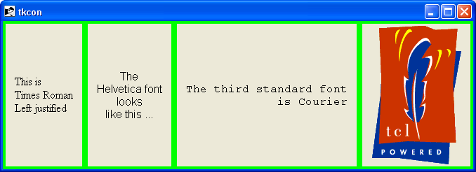 |
The code to create this window with its labels in various fonts and an image is this1:
    #
    # Show some possibilities of labels
    #

    . configure -bg green

    label .label1 -text "This is\nTimesRoman\nLeftjustified" \
            -font "Times" -justify left
    label .label2 -text "The\nHelveticafont\nlooks\nlikethis ..." \
            -font "Helvetica" -justify center
    label .label3 -text "The third standard font\nisCourier" \
            -font "Courier" -justify right

    set labelImage [image create photo -file pwrdLogo200.gif]

    label .label4 -image $labelImage

    grid  .label1 .label2 .label3 .label4 -padx 4 -pady 4 -ipadx 10 -sticky news
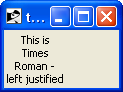
As you can see, labels can display long text spread out over a number of lines. The -justify option determines how the lines are justified with respect to each other. Using the -wraplength option you can let the widget decide the wrapping for itself:
    # Wraplength is in pixels ...
    label .label -text "This is Times Roman - left justified" -wraplength 60
    grid  .label
gives:
|
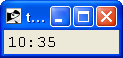
Besides static text, the label widget also accepts the name of a (global or namespace) variable:
    #
    # Use a fixed-width font - otherwise the clock time seems to pulse
    #
    label .time -textvariable time -font Courier
    grid  .time

    proc showTime {colon} {

        #
        # time must be a _global_ or a _namespace_ variable
        #
        global time

        if { $colon } {
            set time [clock format [clock seconds] -format "%H:%M"]
            after 1000 showTime 0
        } else {
            set time [clock format [clock seconds] -format "%H %M"]
            after 1000 showTime 1
        }
    }

    showTime 1
presents a simple clock:
|
10.2 Entry widgets
10.2.1 Validation
10.3 Buttons
10.4 Checkbuttons
10.5 Radio buttons
Radio buttons are a bit special in the sense that a number of widgets work on the same variable:
    set ::fruit none
    radiobutton .r1 -variable fruit -value melon  -text "Melon"
    radiobutton .r2 -variable fruit -value apple  -text "Apple"
    radiobutton .r3 -variable fruit -value pear   -text "Pear"
    radiobutton .r4 -variable fruit -value banana -text "Banana"

    label .choice -text "Chosen:"
    label .chosen -textvariable fruit

    grid .r1 -sticky w
    grid .r2 -sticky w
    grid .r3 -sticky w
    grid .r4 -sticky w
    grid .choice .chosen -sticky w
which results in this window:
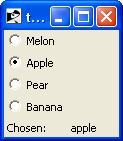
|
Each radiobutton is associated with the variable fruit and each has a string value that is assigned to that variable when the button is checked. Only one button at a time is set, but if the variable has a value that is not among the values of the buttons, none is set.
You can set the radiobuttons programmatically by setting the variable it is associated with. The buttons are automatically updated.
10.6 Scales
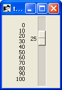
To select a value from a range you can use the scale widget. For instance:
    scale .scale -from 0 -to 100 -tickinterval 10 -variable percentage
    grid  .scale
gives the following window:
|
You can set the position of the slider programmatically by setting the value of the associated variable. You can also specify a command to be run whenever the value is changed, for instance to zoom in or out in a canvas widget:
    scale .scale -from -5 -to 5 -tickinterval 1 -command {zoom}

    canvas .c -width 200 -height 200

    grid   .c .scale -sticky news

    .c create polygon {100 100 100 110 110 110} -fill red

    set prevFactor 1.0
    proc zoom {value}
        if { abs($value) < 0.01 } {
            set value 0.01 ;# Avoid division by zero!
        }
        set factor [expr {$value/$::prevFactor}]
        .c scale all 100 100 $factor $factor
        set ::prevFactor $value
    }
10.7 Scrollbars
Scrollbars are designed to cooperate with other widgets, such as the text widget and the listbox. They come in two flavours: horizontal and vertical scrollbars. Here is how you use them:
    text .text -xscrollcommand {.hscroll set} \
               -yscrollcommand {.vscroll set} \
               -width 20 -height 10 \
               -wrap none
    scrollbar .hscroll -orient horizontal -command {.text xview}
    scrollbar .vscroll -orient vertical   -command {.text yview}

    grid .text .vscroll -sticky news
    grid .hscroll       -sticky news
    grid rowconfigure    . 0 -weight 1
    grid columnconfigure . 0 -weight 1

    #
    # Fill the text widget with some text ...
    #
    set string ""
    for { set i 0 } { $i < 20 } { incr i } {
        append string " $i"
        .text insert end "$string\n"
    }
This cooperation is completely automatic: both widgets know how to deal with positioning the “thumb” and how to react to the manipulation.
If you want to create a scrollable widget yourself, say to scroll a very large canvas, then you need to implement the scrolling protocol yourself. The chapter on the canvas widget contains an example.
10.8 Spinboxes
10.9 Comboboxes
10.10 Progressbars
10.11 Separators
1 The ‘Tcl-Powered!’ logo is available from http://www.demailly.com/tcl/about/logos.html.